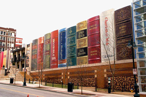
When you think of Kansas City, MO what's the first thing that comes to mind? I'm betting it's not the parking garage of their library. And that's a shame because it should. When the good people of Kansas City decided that the library needed more parking they came up with a unique way to make the new structure attractive as well as functional. The mural in the picture is actually the south wall of the Kansas City Public Library's parking garage, which in its entirety presents 22 titles that were suggested by Kansas City readers and then selected by The Kansas City Public Library Board of Trustees. The Community Bookshelf page on the library's website lists all the titles on the spines of the books and it's a pretty eclectic collection! I wonder whether the library saw an increase in patrons interested in checking out these titles once the mural was finished. The Romeo and Juliet cover is my favorite, must be the tooled leather and the combination of brown and gold. Which one do you like best?

No comments:
Post a Comment